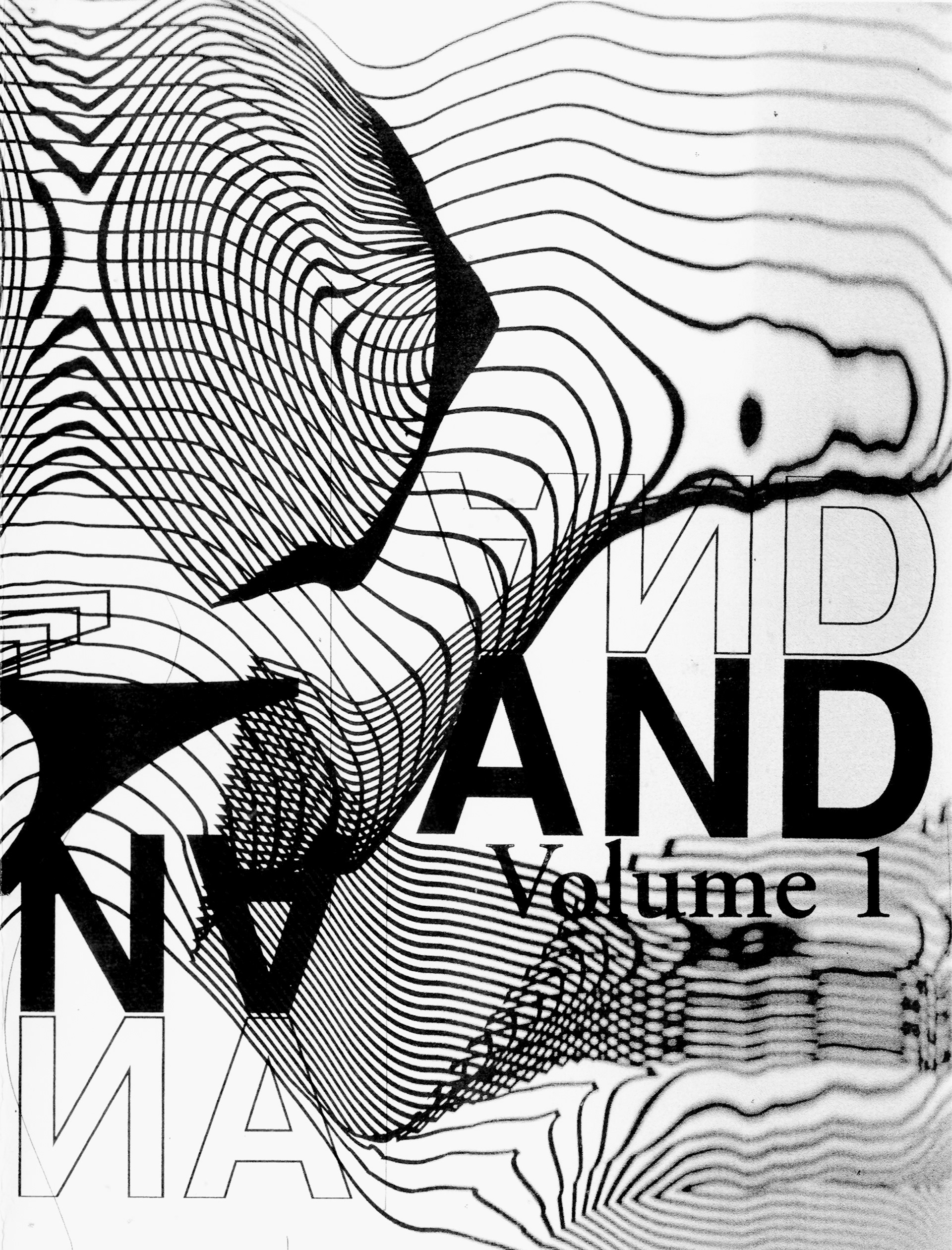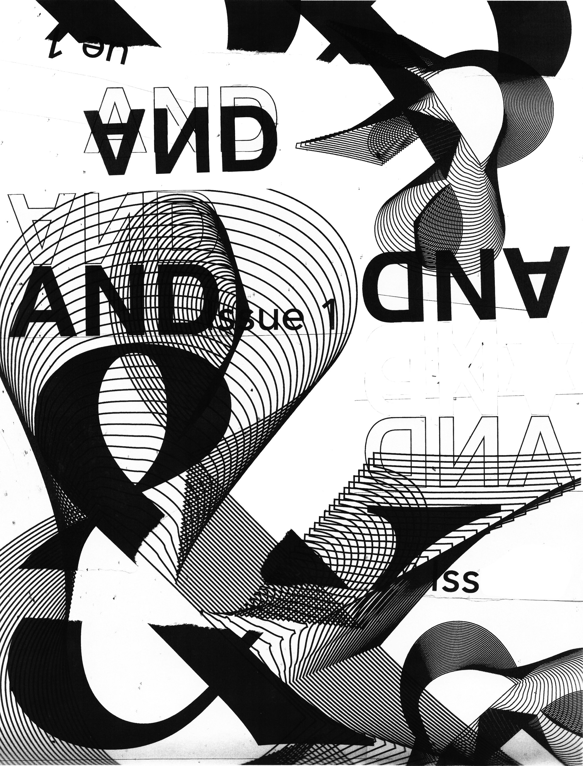
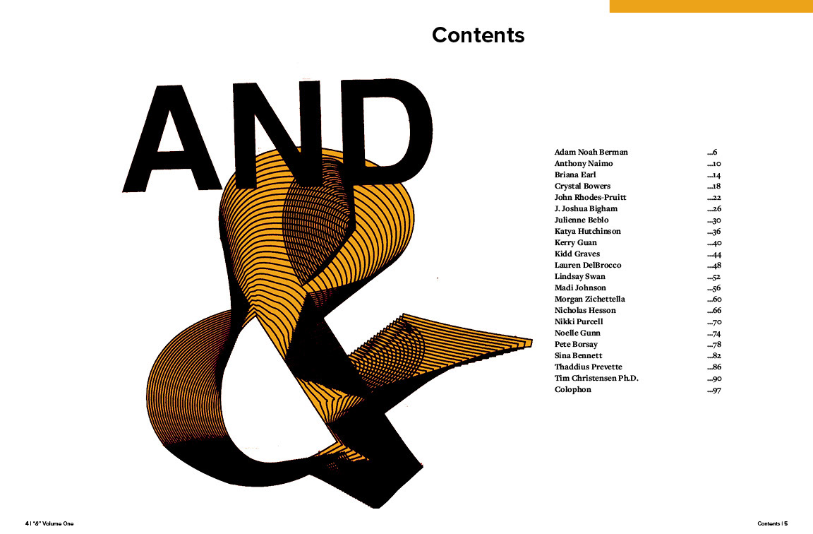
The ampersand can be traced back to the 1st century AD. A ligature of the letters E & T (et, the Latin word for and), the ampersand was originally included as the last character of the alphabet. Over the centuries this eventually became “ampersand,” and the original ligature became the more stylized symbol we know today.
ECU believes “&” best represents their MFA program. “&” is what we use to connect words and introduce additional comments. While we are each our own characters working in our own specific mediums, our passion for art connects our multidisciplinary community.


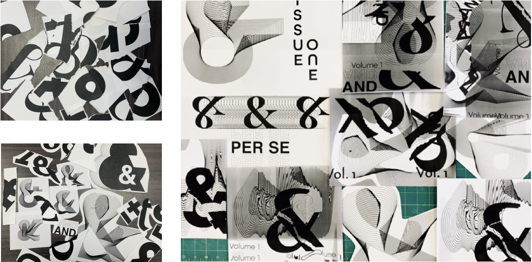
I took an experimental approach to the design of my cover by utilizing a Xerox copier. I printed out the word "and" and the ampersand in multiple sizes, typefaces, and weights. After this initial process, I cut and tore the paper I printed out. I then took to the Xerox machine and began scanning and printing collaged elements. I would rescan the random compositions I created and added additional elements.
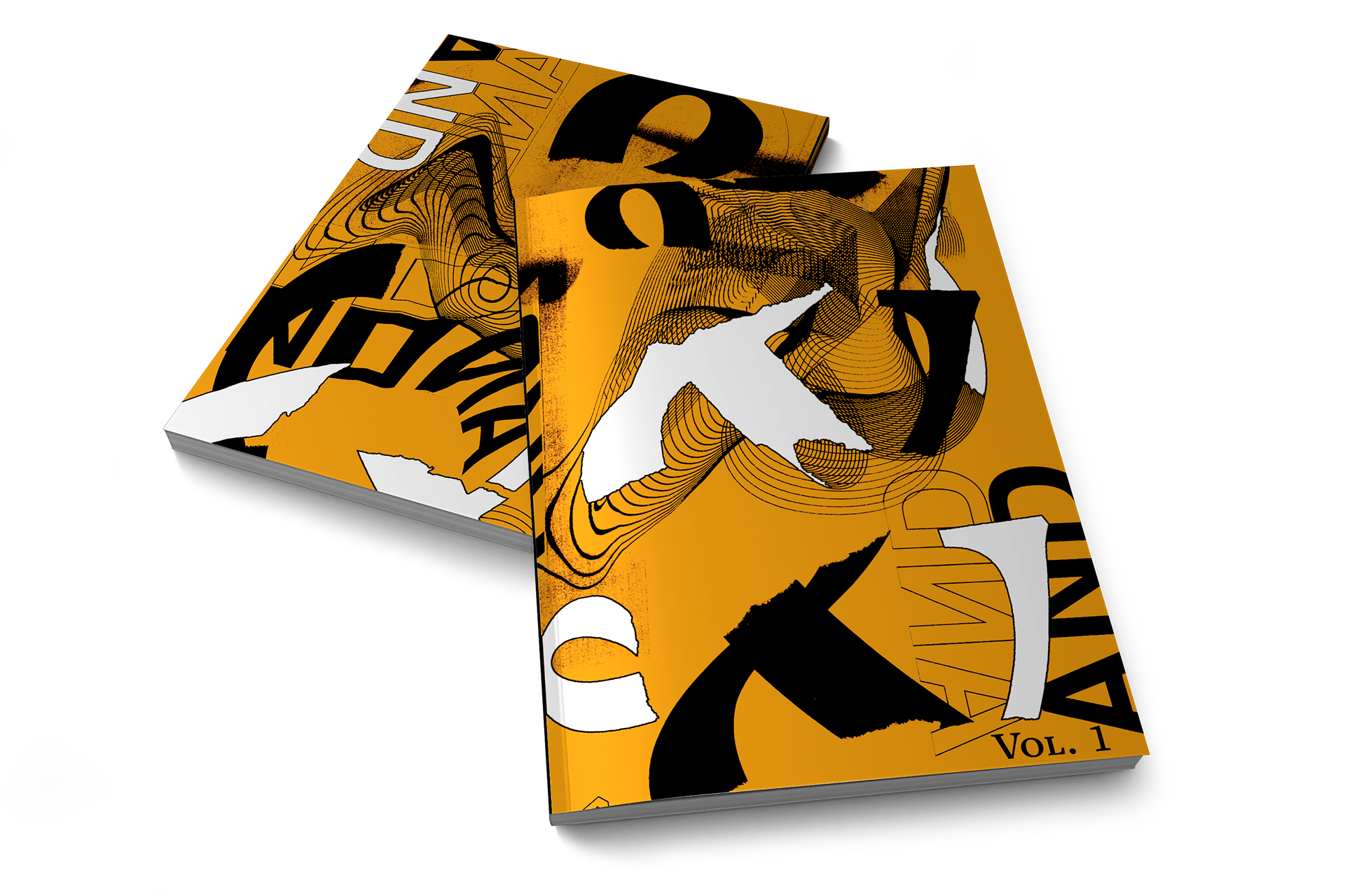
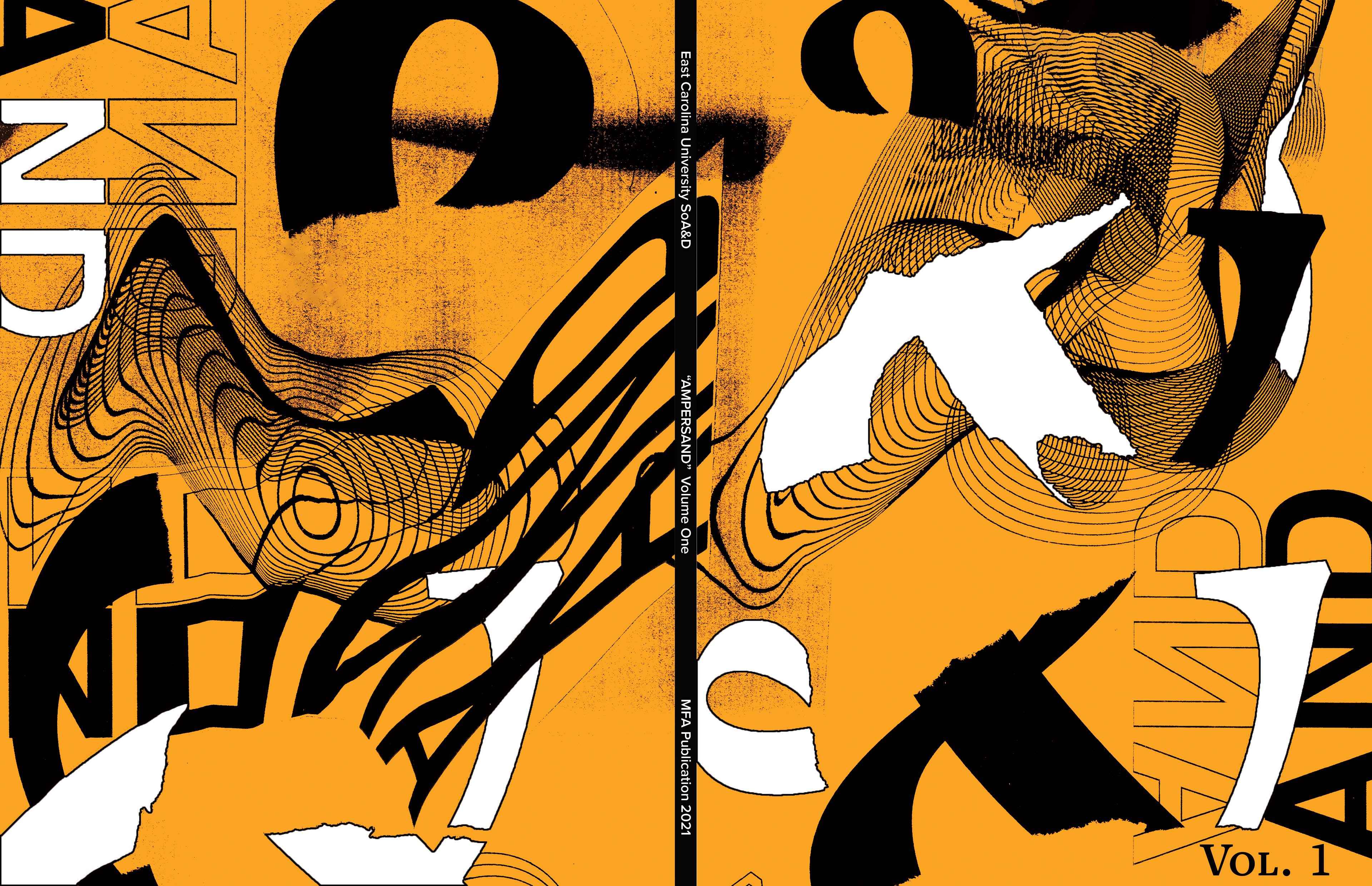
I then took this process digital and took my unique compositions into Photoshop. Within Photoshop I added color to the previous black and white designs as well as added and removed layers. As this is the first issue, I decided to choose the color gold to represent the inception of this publication and set the standard for future volumes.