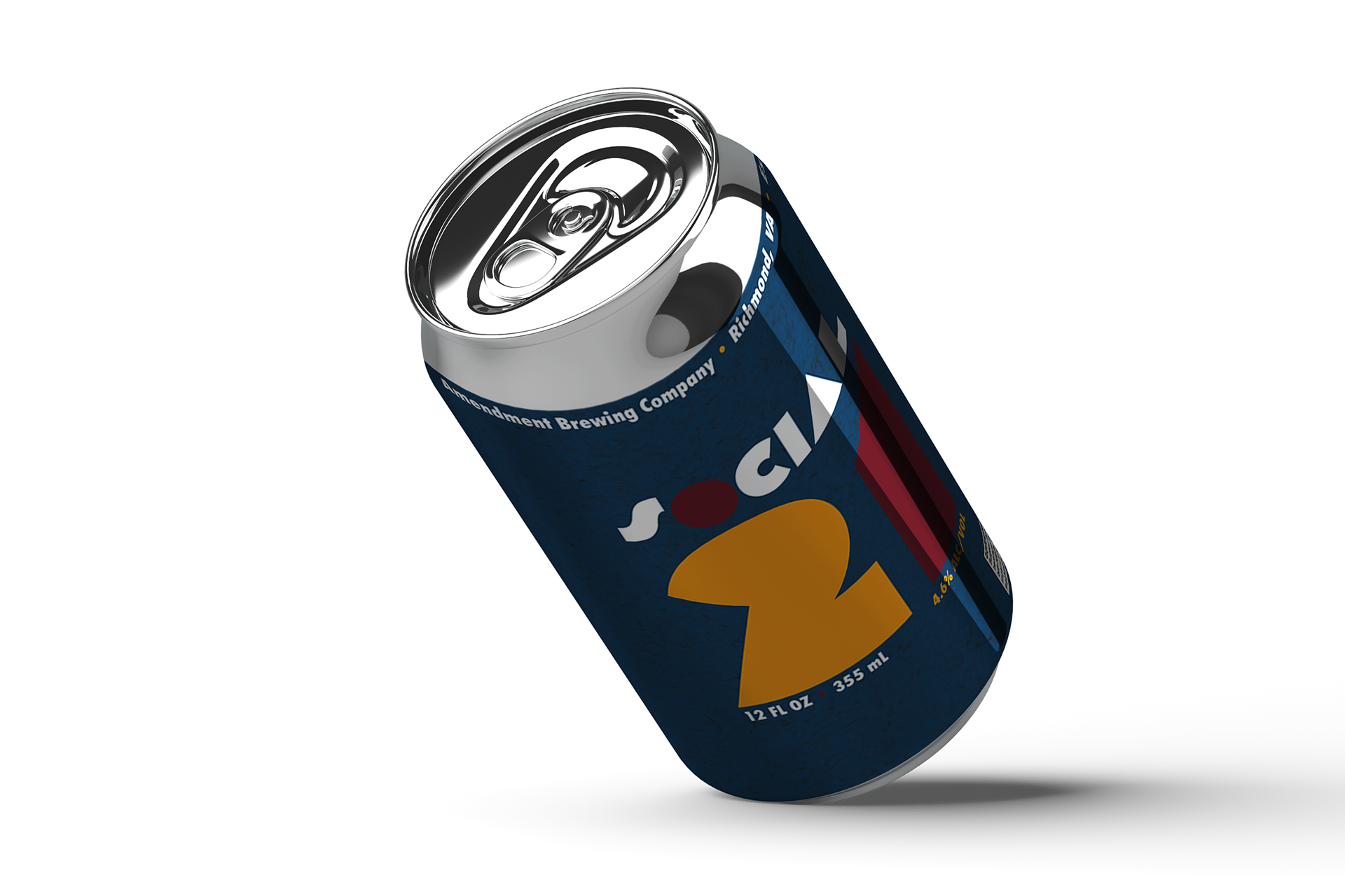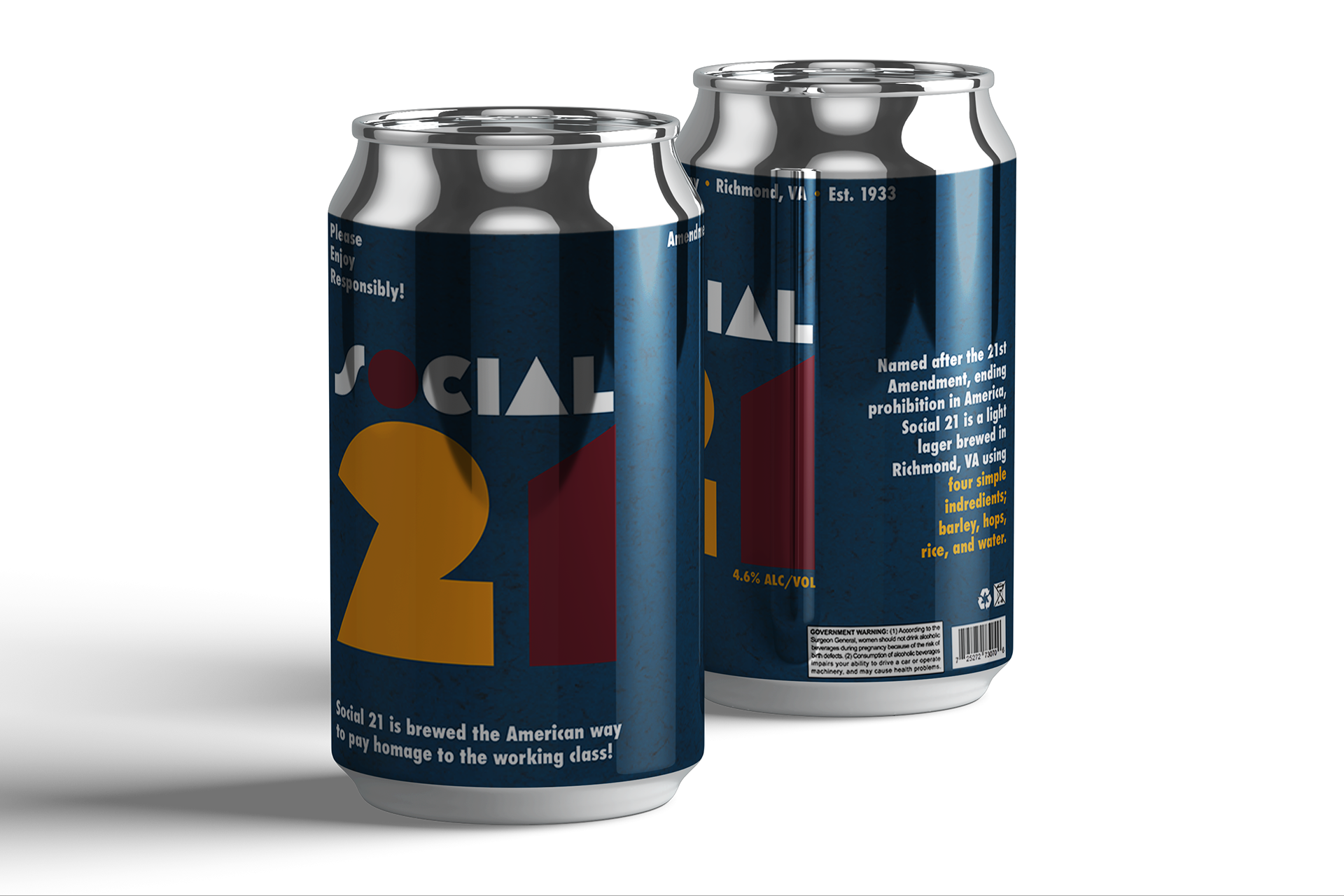
This is a packaging project I designed the brand name, label, and trademark for, and, in addition, created physical mockups. Most packaging for the average light beer feature simple designs and color palettes, a trend I set out to follow when designing for this project. With the idea of simplicity in mind, I decided to choose two typefaces that had easy legibility, but didn't have dull character. I also chose a minimal color palette by using the primary colors; red, blue, and yellow to echo a sense of familiarity.